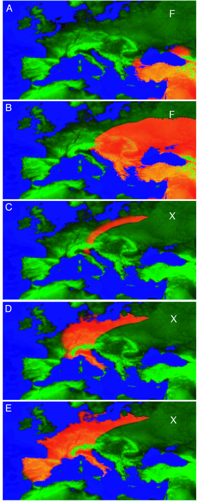
Fig. 2.
Snapshots from our European scenario: fertile areas are bright green, and infertile areas are dark green. Altitude is adjusted for sea-level rise to create an evolving map of Europe since 11,000 B.P. Population density is shown in orange. The first F snapshot shows the bottlenecks around the Black Sea, which act as secondary sources for F (9,500 B.P.), and the second F snapshot shows the final distribution of F. The snapshots labeled X show the evolving distribution of X from 8,000 B.P.).

