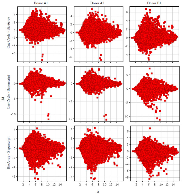
Figure 6.

MA plots comparing the magnitude of change (log(signal array1) - log(signal array2)) on the y axis against the average log signal intensity (x axis). The green threshold lines show ± 2-fold changes. The color coding of the plot indicates the density of probesrepresented by that data point. The kits compared in each plot are given on the right hand side and the donor sample labeled by the kit is indicated at the top of each plot.
