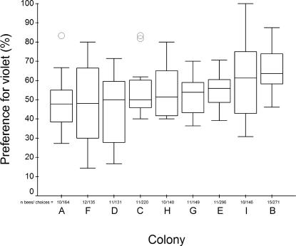
Figure 4. Variation among nine bumblebee colonies in their colour bias for violet (over blue) artificial flowers.
In each box the thick horizontal bar is the colony median, whilst the lower and upper edges represent the 25% and 75% quartiles respectively. Whiskers indicate the maximum and minimum values that are not extreme, and outliers are represented by open circles. Outliers are data points that exceed the distance from the interquartile range box by between 1.5 and 3 times the interquartile range (SPSS Statistical software, SPSS Inc., Chicago, USA). None of these data points were excluded in any analyses. The number of bees tested and flower choices recorded for each colony are displayed along the x-axis, and colonies (A–I) are ranked by increasing colony median value from left to right.

