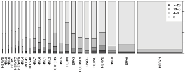
Figure 5.

Proportion of active HERVs in the groups. The proportion of active HERVs in each group is presented with a stacked area plot. The two darkest gray areas together show the proportion of active HERVs in that group, the lightest gray area shows the proportion of inactive HERVs. The widths of the bars are proportional to the size of the HERV group. We can see that the proportion of active and inactive HERVs varies a lot from group to group.
