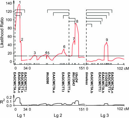
Figure 2.—
Composite interval map for critical photoperiod. (Top) Likelihood ratios. (Bottom) The corresponding R2 for each of the nine QTL. Digenic epistatic interactions between markers are shown as brackets subtended by a dashed line in the top graph. For clarity, individual markers from Figure 1 are shown only if they are mentioned in the results and discussion. For the gene-based markers, both homozygotes and the heterozygote were distinguishable.

