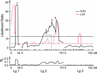
Figure 3.—
Composite interval map for stage of diapause. Top and bottom graphs are as in Figure 2. The dashed red line plots QTL for critical photoperiod as a reference. Note that the QTL for critical photoperiod are scaled down to fit the lower values of the likelihood ratios for SOD and that only the significant QTL for critical photoperiod are shown. The digenic epistatic interaction in LG2 is shown as a bracket subtended by a dashed line in the top graph.

