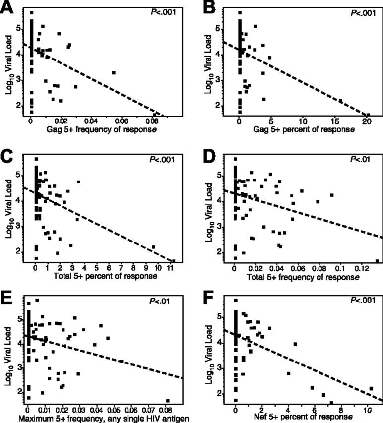
Figure 3.

The magnitude and proportion of the HIV-specific CD8+ T-cell response positive for all 5 functions is inversely correlated with viral load. Each dot represents data from a single progressor. The dotted line represents the linear regression (least-squares fit) line for predicting viral load based on the respective CD8+ T-cell response. Respective P values are shown in the top right of each graph. In the graphs, frequency refers to the magnitude of the antigen-specific response with a specific functional profile within the total CD8 pool, and percent refers to the proportion of the total antigen-specific response that bears a specific functional profile. The graphs depict: (A) frequency of 5+ Gag-specific cells versus viral load (slope =–30.6, r 2 = 0.15); (B) percent of Gag-specific response that is 5+ versus viral load (slope =–13.2, r 2 = 0.16); (C) percent of the total response (all antigens) that is 5+ versus viral load (slope =–23.8, r 2 = 0.19); (D) summed frequency of all 5+ responses from each antigen versus viral load (slope =–12.3, r 2 = 0.09); (E) the maximum frequency of any single 5+ response from any single antigen in each progressor versus viral load (each progressor is only represented by a single point; slope =–19.3, r 2 = 0.08); and (F) the percent of the Nef-specific response that is 5+ versus viral load (slope =–23.6, r 2 = 0.19). Note that the low r 2 values are primarily a function of the large number of values at 0 in the progressors, which cluster at higher viral loads.
