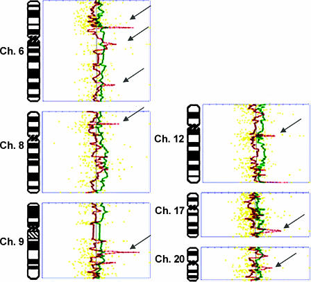
Figure 3.
Comparison of aCGH profiles of synchronous tumors from patient 9. Profiles of P9T1 (green) and P9T2 (red) were generated by Normalise Suite software and superimposed to facilitate comparison. Note the dissimilar regions in chromosomes 6, 8, 9, 12, 17, and 20 (arrows). For each profile, the vertical line on the middle represents a ratio of 1.0. By convention, alterations to the right are copy number amplifications, and alterations to the left are copy number deletions. Thresholds are marked on the graph (top) and indicate 3 SD from the mean. Yellow dotted lines are data points.

