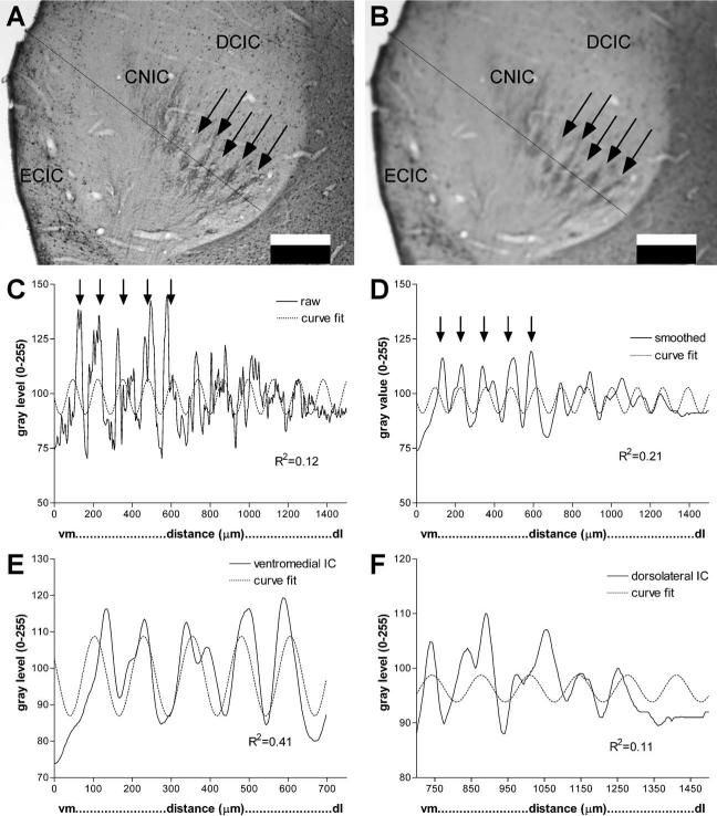
Fig. 4.
Illustration of analysis of banded patterns in IC. Arrows indicate regions in CNIC of dense CB immunostained bands in low magnification images and corresponding peaks in line density plots (major subnuclei of IC are labeled in A and B for reference). (A) Raw gray level image of CB-immunostaining in P1 kitten IC showing a line selected for density analysis. The line begins at the vm and extends dl at approximately a right angle to the central layers of the immunostained plexus (2× objective). (B) The same image and line as in frame A, but the image has been smoothed with a Gaussian filter (Scion Image, 15×15 matrix). (C) Line density plot of gray levels (Scion Image) for the line in frame A. Dotted line is best sine curve fit (non-linear regression). Note the low goodness of fit (R2=0.12). (D) Line density plot of gray levels (Scion Image) for the line in the smoothed image in frame B. Dotted line is the best sine curve fit. Note the higher goodness of fit (R2=0.21) compared with C. (E) Selected segment of line density analysis in frame D for the ventromedial region that is most banded. Dotted line is best sine curve fit for this regular periodic segment of the line plot. Note the high goodness of fit for this portion of the line density (R2=0.41). (F) Selected segment of the line density analysis in frame D for the dorsolateral region is outside the best region of bands. Dotted line is best sine curve fit for this segment of the line plot. Note the low goodness of fit (R2=0.11). Scale bars=0.5 mm for A, B; vm, ventromedial; dl, dorsolateral.

