
Figure 3.
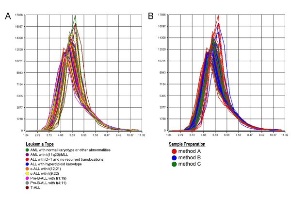
Density curves of global signal intensities. The plots show the overall signal density distribution of all probe sets represented on the HG-U133 Plus 2.0 microarray. The signal used is PS. Data from each microarray analysis is represented by a separate line. The plot is useful to visualize whether there are differences in the overall signal distributions of the experiments. (A) Density curves colored by nine distinct leukemia types. (B) Density curves colored by the three different sample preparation methods.