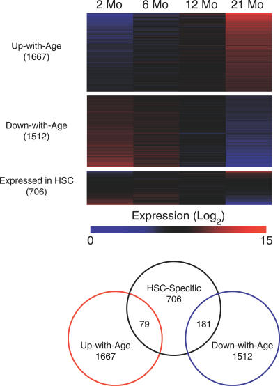
Figure 2. Gene Expression in HSC throughout Aging.
The heat maps show expression levels for four different gene lists, with the degree of overlap among the lists indicated on the right. Color intensity indicates level of expression, where blue signifies low expression and red signifies high expression. Each column delineates the mean expression at 2, 6, 12, and 21 mo, and each row represents a given gene within each gene list. “Expressed in HSCs” refers to genes derived from a comparison of HSCs versus WBM.

