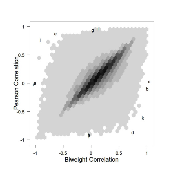
Figure 1.
Scatterplot of all pairwise correlations of the 1000 most variable genes in the yeast data. The blackest hexagons represent 9,556 pairs of genes. The lightest hexagons represent one pair of genes. Notice that, though most of the points lie near the line y = x, there are many pairs of genes that give quite different correlations when measured with Pearson's or the biweight. Each letter refers to a gene pair which will be described in figures (2), (3), and (4).

