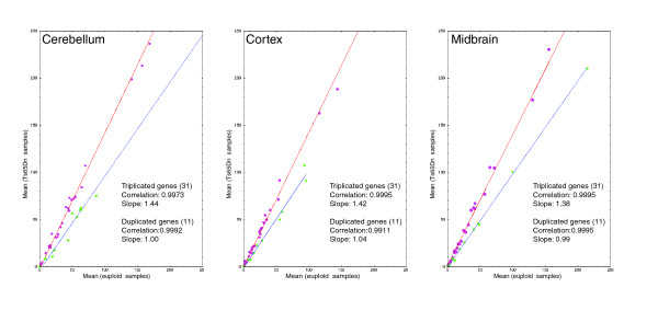
Figure 1.

Linear regression plots comparing trisomic and control animals. For each plot corresponding to a given tissue, the linear regression for the triplicated genes is in red, and that for the duplicated genes is in blue. Each gene was plotted using the average of its normalized expressions obtained from the individuals of a group (Ts65Dn on the y-axis and euploid on the x-axis).
