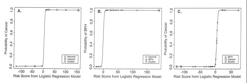
Figure 3.
Sigmoid curves depicting the probability of DNA being classified as normal tissue vs. cancer (A), normal tissue vs. BPH (B), and BPH vs. cancer (C). The curves are based on the logistic regression models depicted in Table 2. The predicted probabilities rise very rapidly over a narrow range, which reflects a high degree of discrimination among groups and a precipitous change in DNA structure associated with the normal to BPH and normal to cancer progressions. Each sample is plotted at its predicted probably.

