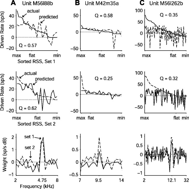
Figure 10.
Examples of WF predictions. A, The unit with the best prediction of one stimulus set from another. Top panel shows the observed driven rates in response to RSS set 1 sorted by rate (solid line) along with the rates predicted by the WF computed from set 2 (dashed line). Middle panel shows the converse situation, with observed rates in response to RSS set 2 (dashed line) and rates predicted from RSS set 1 (solid line). Bottom panel shows the WFs computed from each of the two sets. B, Same as A for a unit with considerable asymmetry between the predictions. The two stimulus sets, although statistically equivalent and linearly related, activate the neuron differently, resulting in a few large prediction errors because of dissimilar WFs (bottom panel). C, Same as A for a unit near the mean of the population quality factor distribution. As in A, WFs from the two sets match fairly well near CF (bottom panel) but exhibit differences away from CF that essentially account for the poor prediction.

