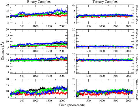
FIGURE 2.
The time-series data from the binary complex are presented on the left panels, and those from the ternary complex are on the right. The vertical label on the right of each row indicates the pair that was monitored. The vertical axis (distance) of all panels are on the same scale for ease of comparison. Clearly, the binary complex is, on average, more open. Each color represents a different subunit and the scheme is consistent for both ternary and binary complex: black, subunit A; red, subunit B; green, subunit C; and blue, subunit D.

