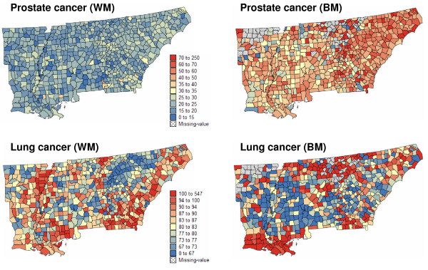
Figure 1.
Maps of age-adjusted prostate and lung cancer mortality rates in 688 counties of the Southeastern US. The fill color in each county represents the age-adjusted mortality rates per 100,000 person-years recorded over the period 1970–1994. To highlight racial disparities, the same color scale is used for both white males (WM) and black males (BM). Hatched areas correspond to missing data (zero death count).

