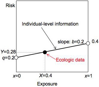
Figure 1.

Risk diagram illustrating Table 1. We summarize individual-level information for a group with a solid black line, ecologic data with a solid black dot. The line connects the risk in the unexposed (q = 0.2 at x = 0) with the risk in the exposed (0.4 at x = 1) and has slope equal to the risk difference b. The ecologic data are the average exposure X and average risk Y for the group.
