
Figure 5.
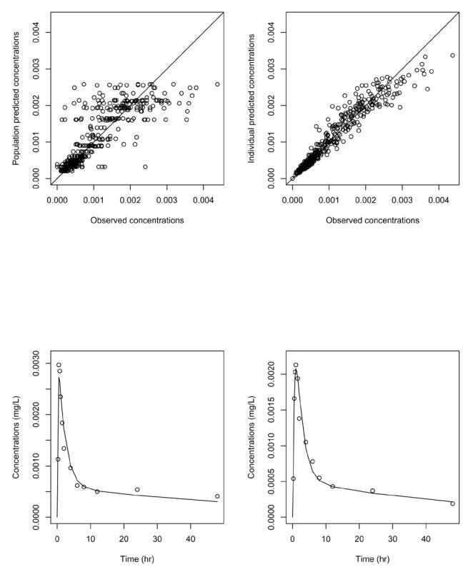
Goodness of fit plots for the final model. Top: population predicted concentrations versus observed concentrations (left); individual predicted concentrations versus observed concentrations (right). Bottom: predicted concentrations (line) overlayed on observed concentrations (dots) for the first man (left) and the first woman (right) in the dataset.