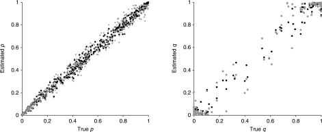
Fig. 1.
Comparison of estimated gene frequencies p and admixture proportions q with true values, for simulated data from two closely related populations. Black points show estimates for codominant markers. Grey points show estimates where allele 1 is dominant over allele 0. p represents the frequency of allele 1.

