Figure 5.

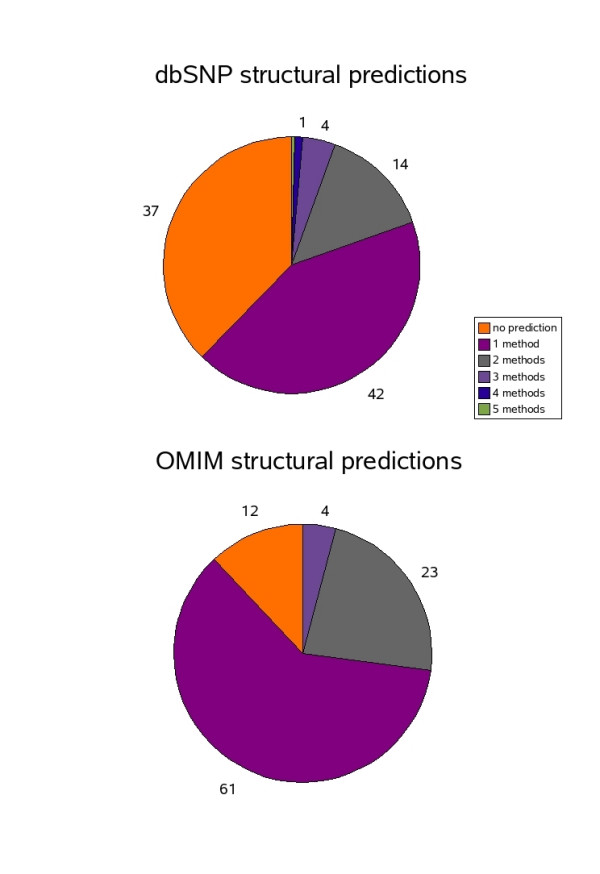
Distribution of predicted structurally deleterious nsSNPs. Pie chart showing percentage of structurally deleterious predictions for OMIM and dbSNP datasets.

Distribution of predicted structurally deleterious nsSNPs. Pie chart showing percentage of structurally deleterious predictions for OMIM and dbSNP datasets.