Figure 3.
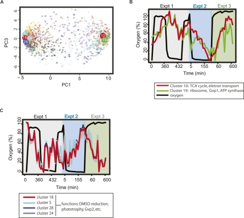
Microarray results reveal two distinct, temporally coherent gene groups that change in response to oxygen for the duration of the stimulus. (A) K-means and principal component analysis (PCA) of microarray oxygen time series data. Each small number on the graph represents the location of an individual gene’s expression profile as projected into the first (X-axis) and third (Y-axis) principal components. Membership in the K-means clusters is color coded, and the location of the centroid of clusters chosen for further analysis and their cluster numbers (5, 10, 18, 19, 24, 28) are plotted as large circles. The annotations for genes contained within each cluster are listed in Supplemental Table 4. Mean profiles of the clusters most significantly correlated and anticorrelated with oxygen are shown in B and C, respectively. (B) Expression profiles for the two most significantly oxygen-correlated gene clusters, 10 and 19, are plotted against the oxygen tension profile (thick black line, left Y-axis) and time points for all three chemostat experiments (X-axis). The mean transcriptional profile of cluster 10, which includes (among others) TCA cycle and oxidative phosphorylation genes, is depicted by the red line; and that of cluster 19, including (among others) ATP synthase, protein biosynthesis, and gas vesicle cluster 1 genes, is shown by the green line. Standard deviations of each gene from the mean transcript profile were omitted for clarity. (C) Expression profiles for the clusters most significantly anticorrelated with oxygen. Clusters 5, 18, 24, and 28 are depicted by the cyan, red, gray, and dark blue lines, respectively. The functions listed in the legend were distributed throughout these four highly correlated clusters.

