
Fig. 2.
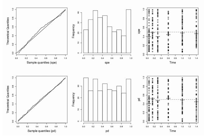
Goodness-of-fit plots under H0, for standardized prediction errors (top) or for prediction discrepancies (bottom), for one simulation in case IIa (N=100, n=3). Left: quantile-quantile plot for a uniform distribution; middle: histograms of errors; right: box plots of the 50 errors at each sampling time versus time.