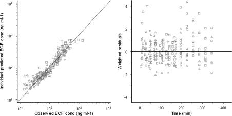
Figure 7.
Goodness-of-fit plots of morphine concentrations in brain ECF for the non-linear transport model. In the left panel, a scatterplot shows the observed morphine concentrations versus the individual model predictions. The line represents the line of unity. In the right panel, the scatterplot shows weighted residuals versus time. The circles represent the data of the 4 mg kg−1 morphine group, the triangles represent the 4 mg kg−1 +GF120918 group and the squares represent the 40 mg kg−1 morphine group.

