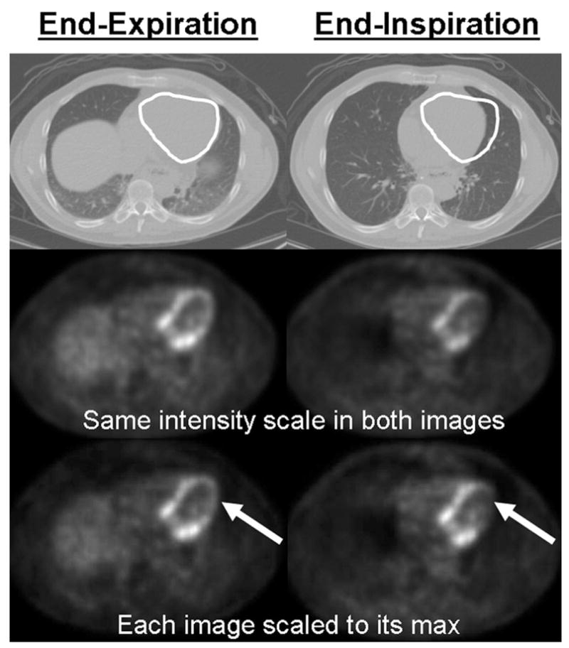
Figure 3.

illustration of the global and regional uptake changes due to the difference between the attenuation maps. Top row: white ROI on the CT shows the magnitude of the heart motion. 2nd row: The same PET emission data reconstructed using the 2 CTs shown in the first row for attenuation correction. These images are displayed with the same intensity scale to illustrate the global uptake change between the 2 images (the image attenuation corrected with the end-expiration CT is globally brighter). 3rd row: The same two images as in the 2nd row but with each image scaled to its max in order to show local uptake changes. The arrows indicate that a large change in regional uptake has occurred between images reconstructed using CTEXPIR (left) and CTINSPIR (right) for attenuation correction.
