
Figure 7. Pairwise Spearman’s correlations of peptide abundance by analysis.
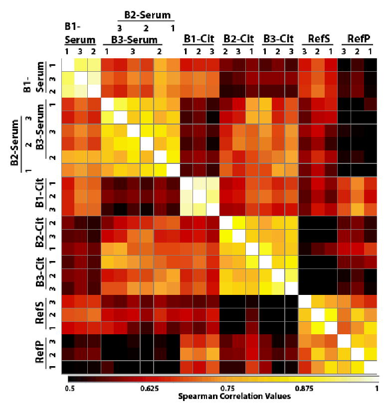
Pairwise correlations [53] of the peptide abundances with the columns and rows are set to pair up by the highest correlation. The darker squares represent the least correlated and the lightest the most highly correlated (scale is set to low value of 0.5 to give a greater visual range to the various values). Highest correlations are within individual samples except in the case of Asian-American and African-American serum samples that exhibited intermixed similarity. In general, the sera and the plasmas were more closely correlated with the exception of the PNNL Ref samples that were from a different source and contained only female serum/plasma.