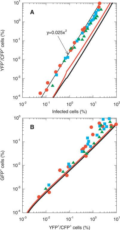
Figure 6. Comparisons of Model Predictions with Experimental Scaling Relationships.
Model predictions (thick lines) obtained by solving Equations 1–6, but withEquation 5d replaced by Equations 9a and 9b, compared with experimental scaling relationships (symbols) between (A) the percentage of coinfected cells (YFP+/CFP+) and the total percentage of infected cells, and (B) the percentage of GFP+ cells and the percentage of coinfected cells. The different symbols represent experiments conducted with cells from different donors [7]. Parameters employed for calculations are identical to those in Figure 2 except that for the red lines t d = 2.8 d in (A) and ρ = 10−3 crossovers per position in (B). The thin black line in (A) is the experimental best-fit line [7].

