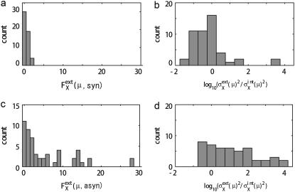
FIGURE 8.
Comparison of noise between synchronous cells and asynchronous cells. (a and b) Distribution of  and
and  respectively, of synchronous cells calculated by sampling 5000 trajectories at the same cell-cycle phases. Distributions over 125 time points are shown. (c and d) Distributions of asynchronous cells calculated by sampling 5000 trajectories at random phases. Distributions over 100 sets of 5000 trajectories are shown. (b and d) Tails of
  are not shown. Distributions at
  arise from proteins that have very small numbers for most of the cell-cycle duration.

