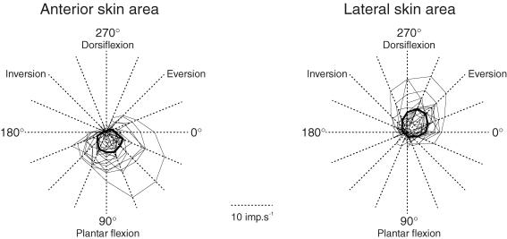
Figure 5. Individual and population preferred sectors.
The response of each afferent to each movement direction was plotted on the axis of the corresponding movement. The points plotted were then connected by drawing thin lines forming a sector which corresponds to that afferent's preferred sector. Delimited by thick lines, the mean preferred sector of all afferents originating from the anterior skin area (left part) differs from that of the afferents from the lateral skin area (right part).

