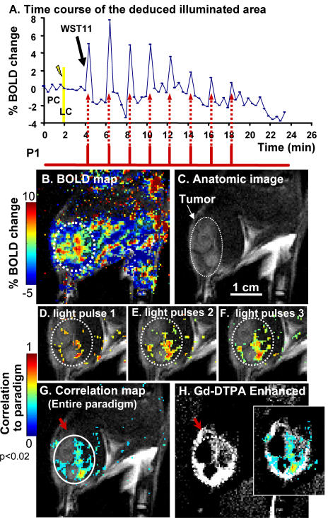
Figure 2. Temporal correlation between illumination and BOLD-contrast changes.
A. Time-course of the BOLD response in the deduced illuminated area (white circle in G). The first 4 min included the pretreatment (PC) and the light control (LC) pulses (200 mW/cm2). Each time point corresponds to a 12 s T2* BOLD-sensitive image. Black arrow indicates WST11 injection to begin photosensitization, using an alternating light∶dark sequence (12 s∶110 s), paradigm P1 (red bars). B. Percent BOLD activation map at t = 6.4 min, overlaid on the anatomic image, C. C. MRI coronal view of the rat thigh, s.c. grafted with MADB106 tumor. A light beam (φ 1 cm) was projected onto the tumor area. The white dotted circle depicts the tumor. D–F. Correlation coefficient maps (p<0.02) obtained after the 1st, 2nd and 3rd light pulses respectively, overlaid on the anatomic image. G. Correlation coefficient map of the entire paradigm (60 images) overlaid on the anatomy, allowing deduction of the illuminated field on the psMR image (white circle) that spatially overlaps with the incident light. The colored pixel clusters represent high blood vessel densities and/or larger vessels in the illuminated zone; while the dark areas represent low/no vascularity. The contrast enhancement ratio of illuminated relative to the surrounding areas was 49-fold (average 33±23SD, n = 8). H. Gd-DTPA contrast enhanced imaging (20 min post-treatment) marks functional, permeable blood vessels. The inset shows the correlation map overlaid on the GdDTPA enhanced image. Note: non-illuminated vasculature is not visible on the correlation map (compare red arrows in G versus H). Dashed white circles represent copies of the white circle in G. BOLD-contrast scale bar relates to (B) and correlation scale bar to (D–G).

