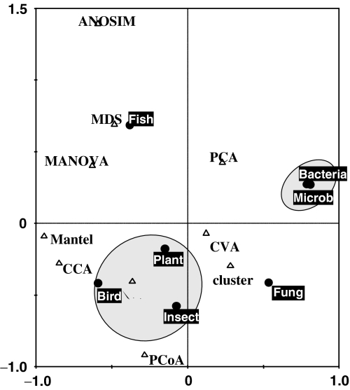
Fig. 1.
Correspondence analysis of method usage in various scientific fields. In this symmetrical scaling of CA scores, the first two axes explained 47.3% and 35.8% of the total inertia of Table 1, respectively. The gray areas were drawn to facilitate the interpretation. Complete row names (scientific fields; full circles) and column names (methods; white triangles) are given in Table 1. Methods (triangles) located close to each other correspond to methods often occurring together in studies. The distance between a scientific field point and a method point approximates the probability of method usage in the field.

