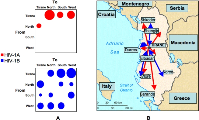
Figure 5. Phylogeographic mapping of HIV-1A and B epidemic in Albania.
A. The bubblegrams show the frequency of gene flow (migrations) in Albania to/from different geographic areas and the country capital Tirane. The surface of each circle is proportional to the percentage of observed migrations in the ML genealogy (supplemental Figure S3). Migrations were inferred with a modified version of the Slatkin and Maddison algorithm [27], [41] for the HIV-1A (top panel) and HIV-1B (bottom panel) subtype from the maximum likelihood inferred genealogies given in Figure 1 and 2, respectively. B. Detailed mapping of HIV-1A (indicated by the red arrows) and HIV-1B (indicated by the blue arrows) gene flow among different Albanian geographic areas.

