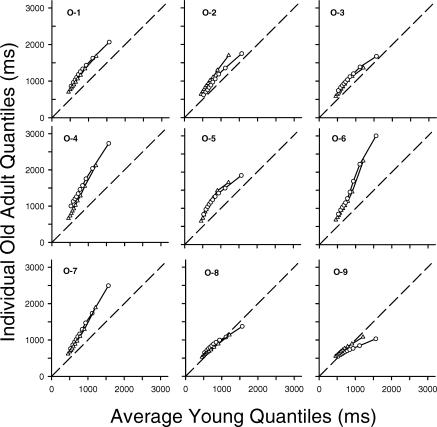
Fig 3.
Individual older adults' quantiles for the same (triangles) and different (circles) conditions plotted as a function of the average young adult quantiles. Data points represent the 5th, 15th, 25th, … 95th percentiles of the younger and older adults' response time distributions. The dashed line represents equal performance: If an older adult's response times did not differ from those of the average young adult, the data points would fall along this line.

