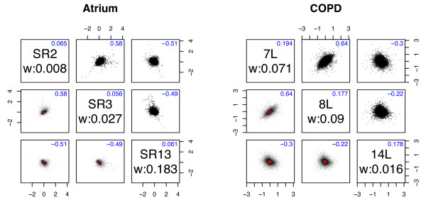
Figure 2.
Pairwise plots. Transformed expression values, Yg, for selected pairs of arrays within the same group. Different pairs within the same group have distinctly different correlations. Upper triangle contains scatterplots. Lower triangle contains heatmaps of the corresponding two-dimensional kernel density estimates, where the majority of the genes are in the red portion of the plot, revealing important trends inside the black clouds. Diagonal red clouds in the heat maps reveal correlations between arrays. Off-diagonal numbers show estimated correlations from WAME. Diagonal boxes contain sample names and weights as well as estimated variances from WAME.

