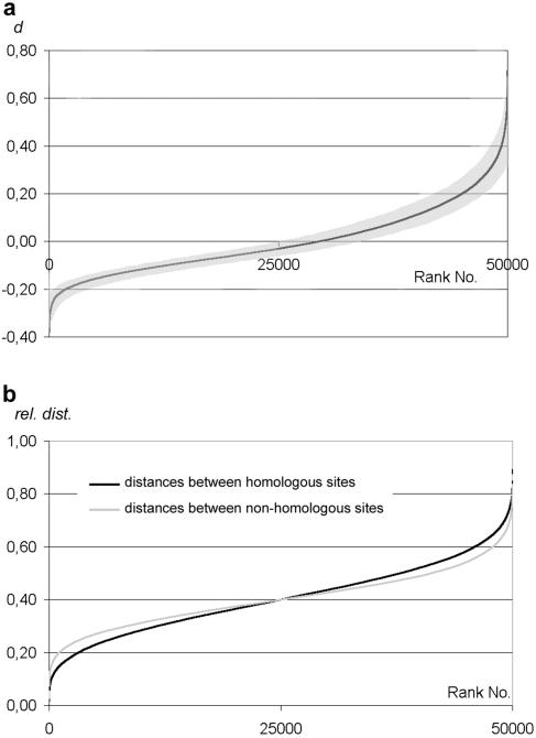
FIG. 3.
Graphs of a simulated ideal random relative distribution of homologous points plotted from 50,000 runs. (a) Distances between homologous and heterologous signals are represented as the difference d between the mean heterologous distances minus mean homologous distances within a nucleus (y axis) and ranked according to increasing d value. Nuclei where the mean homologous distance is smaller than the mean heterologous distance (i.e., where homologous loci are on average in closer vicinity than heterologous loci) are represented by a “d” (which is expressed as a percentage of the nuclear diameter) > 0. Also shown is the 90% confidence interval (shaded area) from 1,000 runs of 50 simulations each. All subsequent graphs depicting homologous versus heterologous distances follow this scheme. (b) Graphic representation of the same simulation according to Weiner and Kleckner (50). For each nucleus, the two homologous distances and the four nonhomologous distances were averaged and then ranked according to increasing values irrespective of their affiliation to a particular nucleus. Deviating from the graphs in (50), the distances are expressed as ratios to the nuclear diameter as described above.

