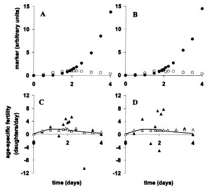
Figure 2.
A critical comparison of the naive and Tikhonov methods. The figure illustrates our numerical analysis of simulated experimental data that contain various levels of random noise. A and C are based on 1% random noise whereas B and D are based on 10% random noise. A and B plot cellular markers of infection that are scored from fluorescent Gen0 (○) and nonfluorescent Gen+ (●) cells. On the other hand, C and D plot our numerical analysis of the data from A and B, respectively, using the naive (▴) and Tikhonov methods (▵). Note that the solid line in C and D represents the true age-specific fertility curve, which is the actual mapping between markers of infection in Gen0 and Gen+ cells (○ and ●). First, to generate noiseless data for Gen+ cells, M+(t), Eq. 7 was used to combine the true age-specific fertility, i(t), with the true time-dependent appearance of markers of infection in Gen0 cells, M0(t). Next, 1% and 10% levels of random noise were added to generate the noise-containing data plotted in A and B, respectively, for Gen0 and Gen+ (○ and ●). Subsequently, we used the naive and Tikhonov methods to estimate age-specific fertility from these noise-containing data. In the presence of small levels of random noise (1%), the naive method, based on least-squares fitting is unexpectedly unstable and produces unusable solutions, whereas the Tikhonov method based on multidimensional minimization yields a good approximation to the true age-specific fertility curve. In the presence of moderate levels of random noise (10%), the naive method fails completely, whereas the Tikhonov method yields a somewhat looser approximation but still works (Table 2). In virological experiments utilizing flow cytometry, we expect that actual data will contain ∼10% random noise. Hence, the Tikhonov method should perform well in laboratory applications.

