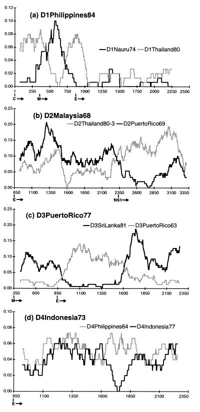
Figure 1.
Diversity plots for putative recombinants and their parents. The vertical axis is the percent difference (Hamming distance) between the query sequence and each parent plotted at the midpoint of each window. The horizontal axis is nucleotide number counting from the 5′ end of the translated sequence (i.e., the start of the C gene). The beginning of each gene is indicated below this axis. Window size and increment were 150 and 3 bp, respectively, in each case. The query sequence is written in bold above the plot, and the gray and black lines represent the results of pairwise comparisons between it and its two parents as identified for each plot. The plots indicate different patterns of relationship for different sequence regions within the same virus, with parts being alternately similar to one, then the other, parent.

