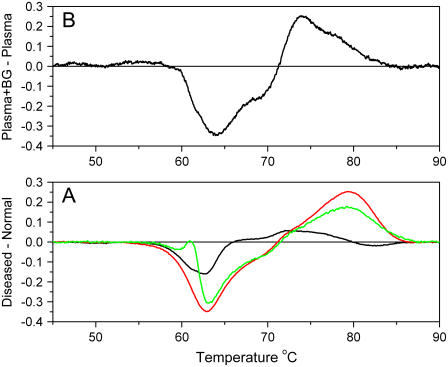
FIGURE 4.
Difference plots of plasma samples. (A) The differences between the average thermograms of diseased plasma and normal are shown: lupus (green), Lyme disease (red), and arthritis (black). (B) Difference in thermograms between normal plasma and normal plasma to which bromocresol green was added to a final concentration of 686 μM.

