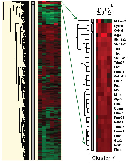
Figure 3.

Hierarchical Clustering. On the left is shown a heat map that resulted from the clustering analysis. Each of the 6 columns represents one of the 6 experimental groups. Red color represents up-regulated genes and green color represents down-regulated genes; the brighter the red or green, the greater the magnitude of change. Black color indicates genes that were not differentially expressed. Cluster 7 is shown on the right along with corresponding gene symbols. The different experimental groups are indicated above.
