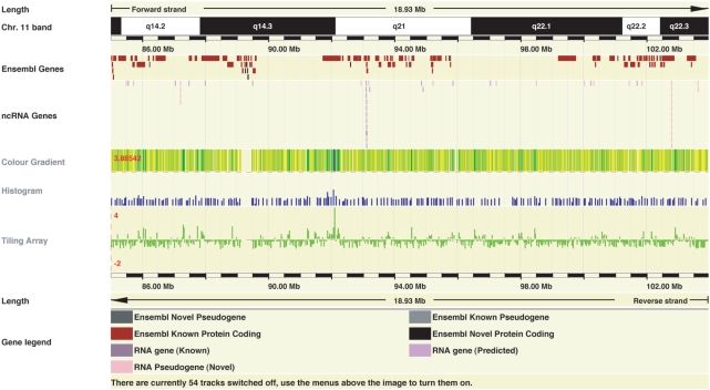
Figure 4.
DAS Visualizations. A 19 Mb region of human chromosome 11 showing identical data displayed with (from top to bottom) the colour gradient, histogram and tiling array ‘wiggle’ format. The colour gradient format transitions from yellow (low values) to blue (high value). The histogram display format supports merged data in bins across the genome; the display value is selectable to be either the average of the bin (shown here) or the maximum value in the bin to achieve greater data contrast. In the histogram format, the lowest value in the data set becomes the baseline. The tiling array format allows for the display of both positive and negative values with overlapping data points resulting in the maximum data point being displayed. All three display formats support in-line data normalization. The ideal format will depend on the data to be displayed. These example data are P-values from a genome-wide association study (30).

