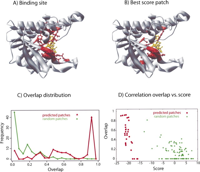
Figure 6.
Detailed analysis of predictions for protein 1dhr. (A,B) In the top panels, the cofactor NAD is indicated in yellow, and the binding residues are in red. The actual location of the binding site (A) is very similar to the prediction (B). (C) Distribution of 100 optimized patches as a function of their overlap with the actual binding site. The distribution of the optimized patches (red curve) peaks at ∼1 (maximum overlap), while random patches (green curve) peak at ∼0 (no overlap). The optimizer is able to find the binding site, in most cases with an overlap larger than 0.5. (D) Scatter plot of the overlap vs. the score for the 100 optimized and random patches; the optimized patches have a lower score than random patches by construction (because of the optimization); moreover, they also have a higher overlap with the actual binding site.

