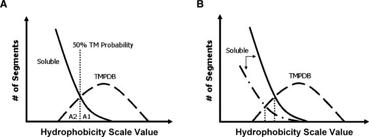
Figure 3.
Schematic illustration of the definition of prediction accuracy as judged from the degree of overlap between hydrophobicity of soluble and TM sequences. (A) Definition of populations used for estimation of prediction errors. Soluble (solid) and TMPDB (dashed) curves schematically represent the hydrophobicity profiles of sequences in the soluble protein and TMP databases, respectively, after normalization to genomic data. A1, the population of sequences falsely predicted to be TM, is the area to the right of the 50% TM possibility line (vertical dotted line) and below the soluble protein profile (solid line). A2, the population of TM sequences that are not assigned as being TM (i.e., missing TM sequences), is the area to the left of the 50% TM possibility line and below the TMP database profile (dashed line). A1 and A2 were used to calculate the misidentification levels for hydrophobicity scales (see legend of Table 1). (B) Effect of the number of soluble sequences (relative to the number of TM sequences) upon percent TM probability versus hydrophobicity. Notice that when the relative number of soluble sequences increases (from dash-dot-dash curve to solid curve), the hydrophobicity value at which there is a 50% probability of a sequence being a TM sequence (vertical dotted line) increases.

