
Figure 3.
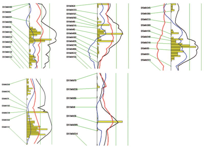
Likelihood plots for carotid lesion QTLs on chromosomes 12, 1, 5, 6, and 11. Plots were created using the interval mapping function of Map Manager QTX, including a bootstrap test shown as a histogram to estimate the confidence interval a QTL. Two straight vertical lines on the plot represent significance thresholds for suggestive and significant QTLs from left to right, respectively. Black plots reflect the likelihood ratio statistic calculated at 1-cM intervals. The red plot represents the additive effect, whereas the blue plot represents the dominant effect.