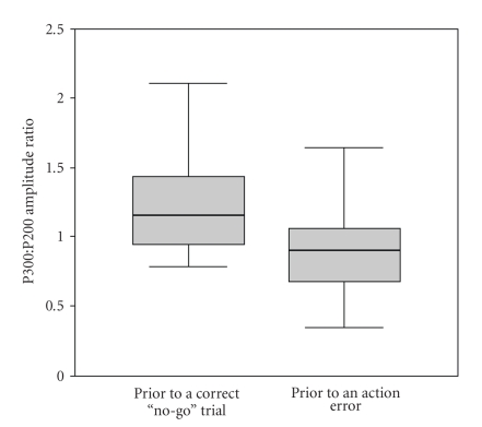
Figure 3.
The difference between go trials preceding a correct or erroneous no-go trial. The figure shows a boxplot for the P300 : P200 amplitude ratio for the two “types” of go trial. Each shows the median (heavy line), interquartile range (shaded area), and total range for the 25 volunteers. Prior to a correct no-go trial, the median normalized P300 amplitude exceeds even the interquartile range of that seen in go-trials prior to an no-go error.

