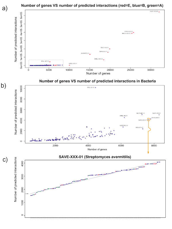
Figure 3.
Dependency of predicted interactions and genome size. a) The x-axis represents the total number of genes for a given query species, the y-axis represents the total number of predicted interactions for that species. b) Enlargement of the dashed box from Figure 3a for Bacteria only. c) An example of a single species plot for Streptomyces avermitilis showing the growth of unique predicted interactions based on the number of genomes analysed. Similar plots for all 184 species are provided as Additional File 5. The distribution of slopes is provided in Additional File 3. Color coding of corresponding genomes/species as follows: Archaea (green), Bacteria (blue), Eukarya (red).

