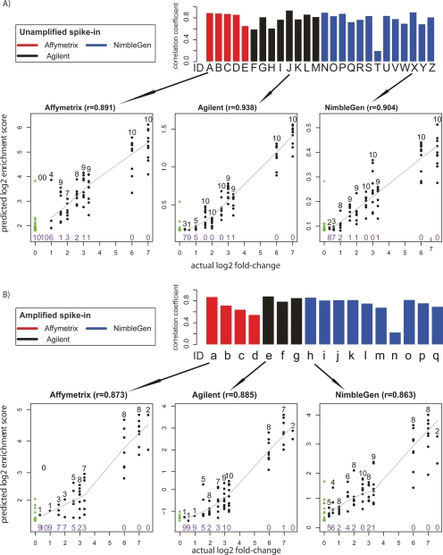
Figure 5.
Analysis of quantitative predictive power. (A) Unamplified samples. Bar plots represent the Pearson’s correlation coefficient r, between the log2 predicted score and the log2 actual spike-in fold-change of the top 100 predicted sites. Arrows below each bar graph point to scatterplots representative of data from each microarray platform. In the scatterplots, true positives are shown as black dots, with the number of true positives indicated above the dots in black type at each fold-change level. The number of false negatives is indicated in purple type below the points at each fold-change level. The solid line represents the LOWESS smoothed curve for all true positives. False positives are shown as green triangles, and are on the far left of the graph because of their actual log2 fold-change values of 0. (B) The same as A, but for Amplified samples.

