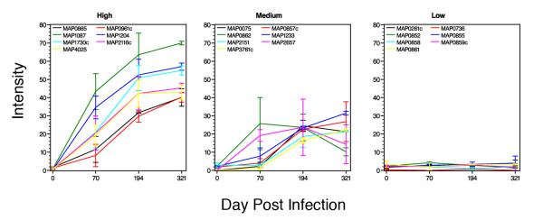
Figure 3.
Temporal trends of protein reactivity in experimentally infected cattle. The lines show the average intensity for each protein over the course of the study period. The range observed between the two calves is indicated by statistical bars. Kernel Density Estimation performed on the log-transformed maximum intensity scores indicated there were three distinct normally distributed peaks. These distributions are statistically significant and define the proteins belonging to the weak, moderate, or strong response groups. The graph labeled high contains the seven proteins most strongly detected by the cattle sera and the graph labeled low contains the seven proteins that showed the least reactivity with cattle sera. The seven proteins in the medium category are also representative of reactive antigens that either showed low reactivity initially or declining reactivity with time.

