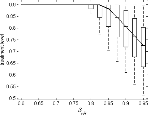
Figure 4. Sensitivity analysis showing box plots for the variations in the optimal constant treatment level (below 90%) as a function of δrH, with other parameters sampled from their respective ranges, as described in “Text S1”.
The solid curve passes through the median values of the treatment level, and each box contains 50% of data points between the first and third quartiles of the sampling distribution. The remaining 50% of data points are represented by whiskers.

