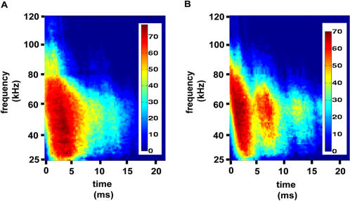
Figure 4. Spectrograms of the weighted support vectors on each side of the hyperplane.
The color bars are in dB. (A) The apple spectrograms used as support vectors added up according to their weights. (B) Same as A for corn. Examining the two weighted spectrograms, the idea of the support vectors, being the most difficult data points to separate in the limits of the data set, becomes clearer.

