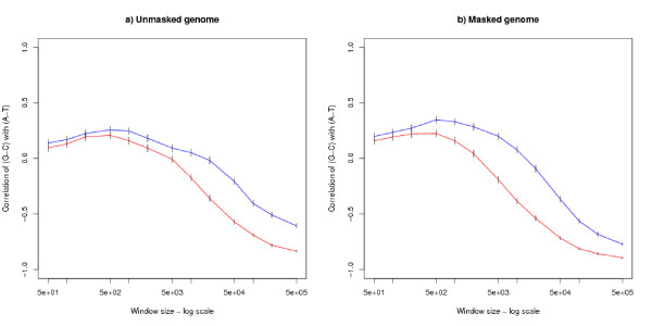
Figure 4.
Analysis of transcribed and non-transcribed regions in the human genome. The graph shows correlations of (G - C) versus (A - T) by window size for a) the unmasked and b) the masked genome. For both subgraphs, each point is based on a sample of 4000 windows lying entirely within a region which is transcribed (the red lower line) or not transcribed (the blue upper line). The error bars show 95% confidence intervals.

